I Rebuilt My Magazine's Launch Email With AI. Here's Exactly Where I Took the Wheel Back.
Quick transparency note before we start: I'm part of Flodesk's Partner Program for the launch of Flodesk Studio, which means I was compensated to create this post. I only say yes to partnerships that pass my own bar — and as you're about to read, this one made me think harder about AI than almost anything I've tried this year. Everything below is my real, unfiltered take.
I have a complicated relationship with AI.
Not the "I'm scared of robots" kind of complicated. The kind where I've watched too many brands hand their voice over to a prompt box and get back something that sounds like everyone else's brand. The kind where "AI-generated" has started to feel like a synonym for lazy in my industry, and I've built my entire business on the opposite premise: that strategy is the thing that can't be automated, even when the execution can.
So when Flodesk asked me to try Studio, their new AI email design tool, before I wrote a single word about it, I wanted to actually use it on something real. Not a throwaway test email. Something with my name attached to it, that my community would actually receive in their inbox.
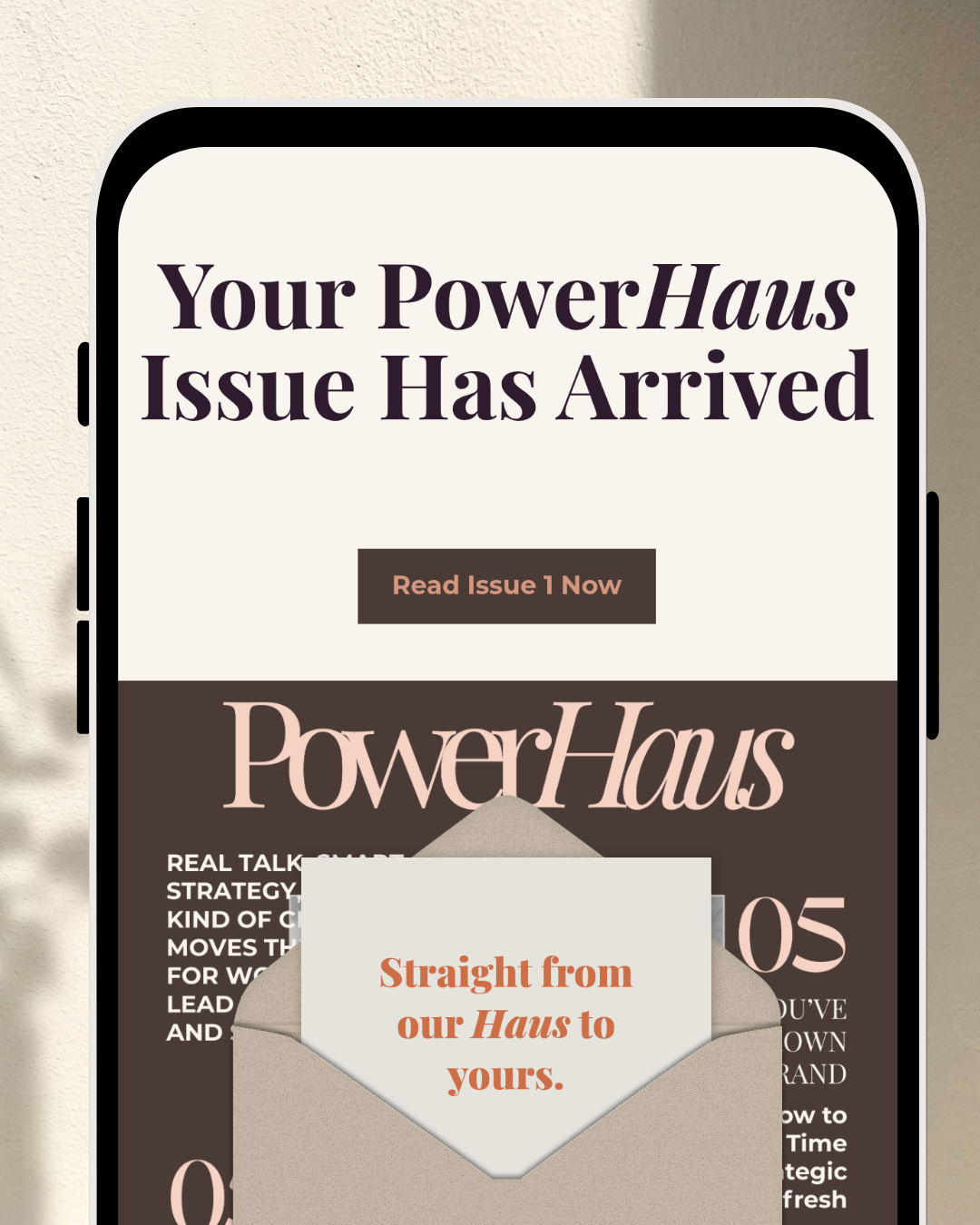
I picked the PowerHaus Digital Magazine delivery email, the one that goes out the second a new issue drops, that has to feel like the moment, not just a notification.
The actual moment.
I already had a version of this email built elsewhere. So this wasn't "can AI make me an email from nothing"; it was a harder test: can it take something I've already made with care, and help me make it better, faster, without it starting to sound (or look) like it wasn't mine anymore.
I opened Studio, dropped in a prompt describing the vibe I was after (editorial, a little bit "magazine just landed on your doorstep," warm and confident, using PowerHaus's existing colors and type), and it gave me three directions to react to. Not one polished "here you go," but options. That distinction matters more than it sounds like it should.
A tool that hands you one answer is asking you to accept it. A tool that hands you a few is asking you to have taste.
From there I did what I always do: I kept the bones that were working, and I rebuilt the rest by hand. I moved things pixel by pixel. I swapped a block here, rewrote a line there, adjusted spacing until the "Read Issue Now" button sat exactly where my eye wanted it to land. I refined some sections in chat and some by just... doing it myself, the way I'd drag and drop in any other builder.
By the end, I had a "Your PowerHaus Issue Has Arrived" email with the kraft-paper envelope graphic, the script logo treatment, the terracotta CTA …and it did not feel like a template with my logo slapped on it. It felt like mine. That's the only bar I actually care about: does this look and sound like me, or does it look like AI with my brand colors borrowed for the afternoon.
The most useful thing Studio did wasn't write anything for me. It was clear enough workspace, fast enough, that I could spend my energy on taste instead of tedium.
What I loved
The speed was real! What usually eats an hour of block-building and spacing tweaks took me a fraction of that. But the part that actually earned my respect was that the foundation didn't feel generic. Flodesk has said it plainly, and I'll say it too because it's true: this was built on a human-designed foundation, accelerated by AI, not generated by it. You can feel the difference between a layout a design team actually built and one that was purely pattern-matched into existence. One has taste baked in before you ever type a prompt. The other is guessing.
I also appreciated that when I was done, I wasn't locked in. Design here, send anywhere! Studio exports clean HTML to any provider that accepts it, not just Flodesk. For someone who's spent a decade telling clients "own your systems, don't rent them," that's not a small detail. It's the difference between a tool and a leash.
It's also worth saying plainly since Flodesk is still figuring out what this becomes: it's free while it's in beta. No credit card, no asterisk I could find. If you're curious, the cost of trying it is genuinely zero.
What I did not let it touch.
Here's the part I actually want you to sit with, because it's the whole reason I said yes to this partnership in the first place.
I did not let Studio decide what story led that issue of PowerHaus. I did not let it decide the emotional arc of the subject line, or whether "Straight from our Haus to yours" was the right closing line versus something more direct. I didn't let it choose the three words that needed to carry the most weight in that email, because those three words are a judgment call about what my community needs to feel in that exact moment — proud, invited, seen. That is not a design decision. That's strategy. That's the part of my job an algorithm can't do, because it doesn't know my community. I do.
That's the tension I keep naming, over and over, because I think it's the actual differentiator right now …not "AI good" or "AI bad," but knowing exactly which parts of your work are craft and which parts are judgment, and refusing to let a tool blur that line for you. A lot of what's marketed as AI right now is built to be a copilot, something that does the thinking for you so you can disappear from your own work a little more each time.
I noticed Studio wasn't positioned that way, and honestly, it's the reason I stayed in it longer than fifteen minutes. It didn't try to be my assistant. It behaved like a place I was building in, not a person doing the building for me. That's a distinction more tools should care about.